Blog / Collaboration
What’s a UX Sitemap and how to create your own
By: Edo Begagić
▪
1. What is a UX Sitemap
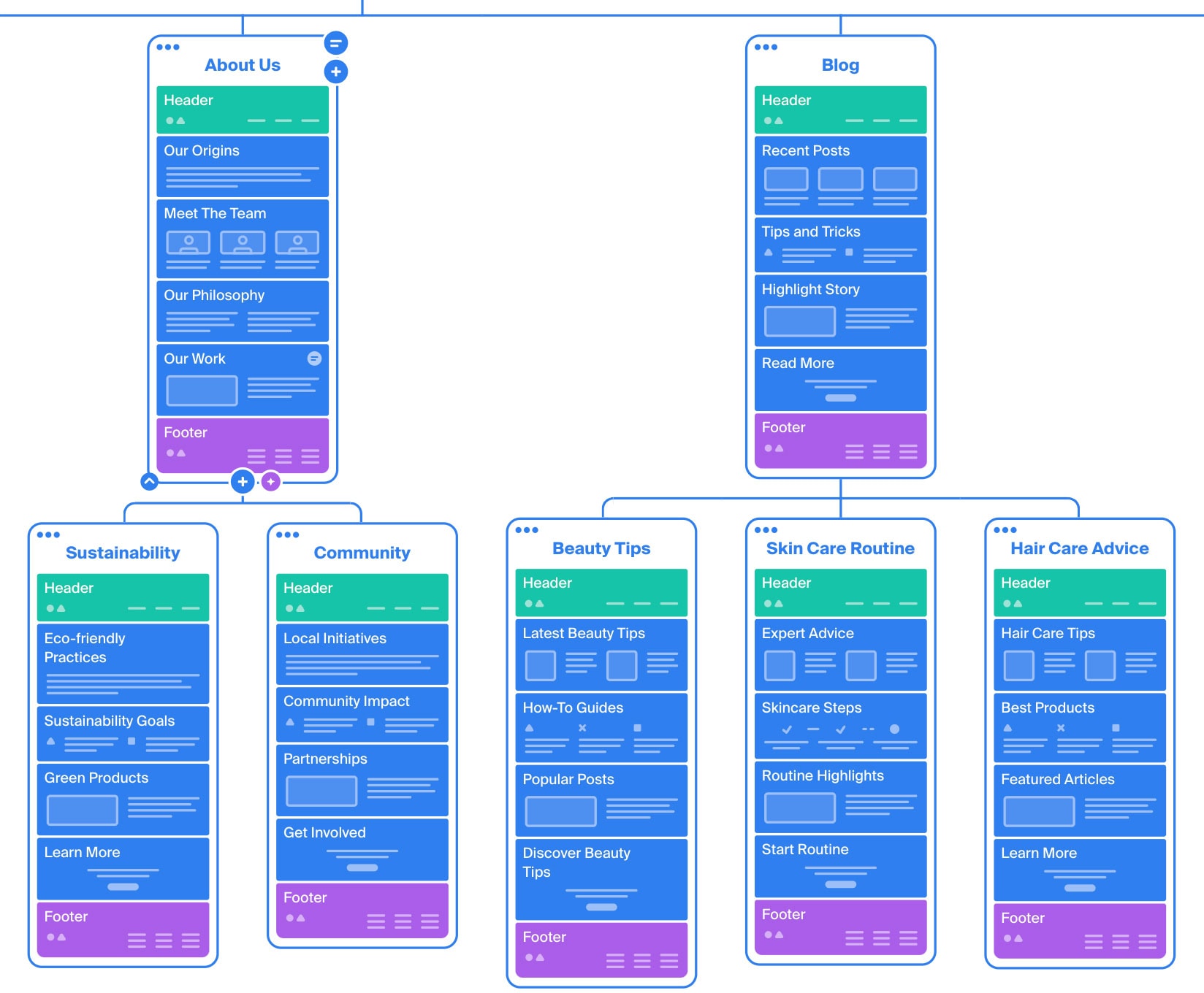
A UX sitemap is a visual tool that helps organize and outline the structure of a website or app, focusing on user experience. It outlines the hierarchy and relationship between different pages and helps identify missing content, prioritize key elements, and design a digital product that's easy to navigate.
Definition of UX Sitemap
When talking about web design, a UX sitemap provides an overview of a website’s layout, mapping out how different pages relate to each another.
In web design & web development, a UX sitemap serves also as a collaborative tool, where designers, developers, content creators, and clients use it to align the website’s layout with business goals and user needs.
A UX sitemap can be seen as a map or skeleton of the website, whose purpose is to establish a proper structure. It's usually implemented in the early stages of web design, since it’s later used by the designer to create wireframes for the website, but also as a reference for development.
Difference between UX Sitemap and XML Sitemap
When researching about sitemaps, it's likely to encounter information about another type of sitemap - an XML Sitemap. To prevent confusion, it's necessary to differentiate between these two. While an XML sitemap is a file that lists a website’s essential pages, helping crawlers to better understand a website. In contrast, a UX sitemap is part of the design process with a focus on how to organize content and create a logical flow that enhances user experience.
2. Core concepts of UX Sitemap
To create an effective UX sitemap, it's important to have some basic understanding about certain concepts. While it is not necessary to be an expert in Information Architecture (IA), having a fundamental grasp of some principles will enhance the quality and usability of the UX Sitemap.
Information Architecture (IA) Principles
Information Architecture involves organizing and structuring the content of a website in a way that is easy to understand and navigate for users. It’s important for UX Sitemaps because it helps plan the structure of the website. Key IA principles for a good UX sitemap are
- Organizing Content: Grouping and labeling content in a way that makes sense, so users can easily find their way around.
- Navigation: Understanding global vs. local navigation and creating a structure that guides users smoothly through the site.
- Content Relationships: Showing how different pieces of content are connected, making it easy for users to find related information.
- User-Centered Design: Designing with users in mind by considering how they will use the site.
- Accessibility: Making sure content is easy to find and accessible for all users, including those with disabilities.
For more details about information architecture please see the following article: Information Architecture (IA). This article provides a basic foundation on Information Architecture, which is useful when creating a UX Sitemap.
Basic UX Design Concepts
Basic UX design concepts focus on understanding user needs and creating easy-to-use interfaces. Applying these concepts ensures that user needs and business goals are being met. Key concepts include:
- User Needs and Goals: Understanding who the users are and what they need from the website. This helps in prioritizing content and structuring the sitemap.
- Content Inventory: Knowing what content exists and what needs to be added. This ensures that all necessary information is included and organized in the sitemap.
- Business Goals: Aligning the sitemap with the business objectives of the website. This ensures that key pages are easy to find and support the overall goals of the website.
This information provides a good foundation to create a UX sitemap that not only organizes content logically but also enhances the user experience and supports the website’s objectives.
3. Key tools for creating Sitemaps
Creating a sitemap can begin with tools as simple as pen and paper. Hand-drawing a sitemap allows for quick brainstorming and helps with visualizing the overall structure of the website or app before moving to digital tools.

Some digital tools that I found helpful are Octopus.do and ChatGPT. Octopus is a tool that allows users to create a sitemap from scratch using a simple drag-and-drop interface, making it easy to organize and rearrange pages. Additionally, Octopus offers interesting features such as AI generation and URL sharing, allowing users to share the sitemap with clients directly through Octopus.

ChatGPT is a useful tool as well when it comes to sitemap creation, as it can help structure information and generate initial ideas.
The complete sitemap can be done via Octopus.do. However, for presentation purposes, I prefer to move the sitemap into Figma, as I like to keep all design-related pieces in one file.
4. How to create a UX Sitemap
While tools like Octopus.do and ChatGPT can significantly enhance the process of creating the sitemap, the success of a sitemap depends on understanding the project’s goals, user needs and how to structure content effectively. I use these tools to support my workflow, but always keep the focus on creating a user-centric, goal-oriented sitemap.
To create an informed sitemap it's usefull to take following steps:
- Reference the design brief
- Pay special attention to project goals
- Gather all existing content
- Check out similar websites for inspiration
- Organize content and create the sitemap
- Review the sitemap with the client
Reference the design brief
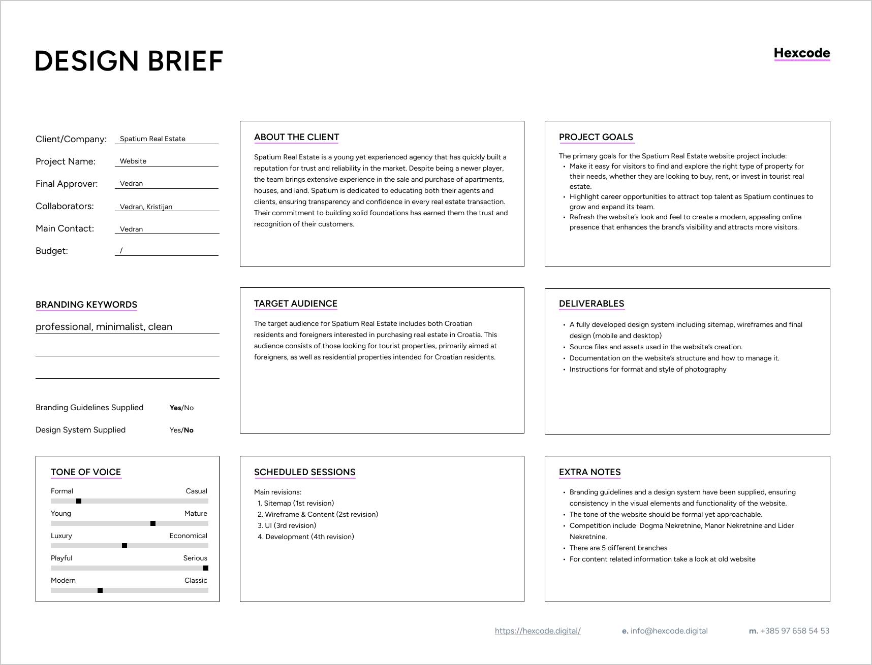
In order to successfully gather information about the client, such as company information, branding keywords, tone of voice, target audience and project goals, it is important to conduct an initial interview and together with the client fill out a design brief.
Why a Design Brief should be the first step in every Design Process
A well-structured design brief provides clarity and direction, ensuring that both the designer and the client are aligned on the project goals. Want to learn more? Explore how to set up a design brief:
By having a filled out design brief it's possible to reference it during the whole Sitemap creation process, and be sure that informed decisions are being made.
Pay special attention to Project Goals
Defining project goals is actually something that happens during the design brief phase. However, when creating the sitemap, it’s important to be mindful of these goals and not lose focus. Project goals can be as simple as gaining more leads or selling more products, but it's important to remember that not every business has the same project goals. Some businesses want to raise user engagement by creating long-term users through high-quality content, while others want to present their products in a specific way and make it easy for users to contact them.
Gather all existing content
Doesn't matter if it's redesigning an old website or creating a completely new one - it’s important to gather as much information as possible about the product and the client. This information will come from the design brief as well as from all available documentation, photos, etc., which the client can provide. Everything is valuable, and the designer has to ensure that the client provides all the information they have.
If the client has an old website, it’s helpful to take a look at it. If they have a brochure or some photos, it’s worth reviewing those as well. Every bit of information can provide a better sense of how to present their content and understand the strengths and weaknesses of their business. For example, if the client doesn’t have high-quality photos or has none at all, it might be better to avoid designing a sitemap that emphasizes images, like including a gallery page.
Check out similar websites for inspiration
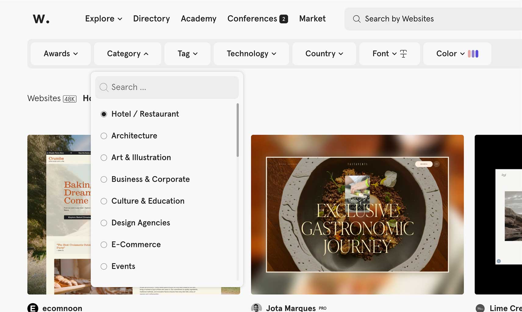
Businesses in a similar branch or niche often have similar content, which is why it's important to analyze similar projects, apps, or websites. When filling out the design brief it's possible that the client will mention some websites that could be used for inspiration, but it’s necessary to also do our own research. For example, when researching related apps and websites we can get a feel for how the industry works, what the competition is doing right, and where they might be falling short. Besides gaining an understanding of the niche by exploring a competitor’s website, it's possible to spot good or bad UX practices, which can help inform our own approach when creating the sitemap. I will do research on Awwards, WebDesign Inspiration and similar websites to see how award winning sites approach structuring their content.

Create the Sitemap
After gathering all the existing content and researching similar websites for inspiration, the next step in creating a UX sitemap is to organize the content strategically. This means taking the raw information that has been collected and arranging it in a way that aligns with the project’s goals and meets user needs. Some key points that should be considered are:
- Outlining basic structure - The sitemap creation should start by outlining the main sections of the website, such as the homepage, about page, services or products page, and contact page. From there, it's possible to break these sections down into subcategories or child pages. It's important to ensure that the hierarchy is clear and intuitive, guiding users through the site in a way that makes sense and supports the website's objectives.
- Aligning with Project Goals - The content structure should always reflect the primary objectives of the website. Whether the goal is to generate leads, sell products, or educate users - the content should be organized with that in mind. For instance, if the primary goal is to drive sales, product pages should be easily accessible from the homepage and prominently featured in the navigation. If the goal is to educate users, resources like articles or case studies should be the main focus.
- Reflecting user needs - The sitemap should align with user needs by organizing content based on how users search and navigate. Insights from user research can help prioritize sections, like for example placing “Support” on a SaaS website where users can easily find it. This ensures that the site structure matches user behaviors and simplifies navigation.
- Grouping and labeling - Effective content organization involves grouping related items together and labeling them clearly. This makes navigation straightforward and helps users understand where they are on the site. For example, all customer support resources might be grouped under a “Support” section, with subcategories for FAQs, Contact Information, and Troubleshooting Guides. Each section and subsection should be labeled in a way that’s immediately clear to the user, avoiding misleading or too complex terms.
- Balancing content - This means to ensure that content is evenly distributed across the site. It's good for user experience and SEO to avoid having one section that's overloaded with information while others are thin in content.
- Multiple iterations - After the initial draft, it's good to iterate the Sitemap a couple of times and rethink some decisions. Once the sitemap seems done, it's ready to be reviewed with the client.
Review with the client
After creating the Sitemap it's important to review it with the client. It’s essential that the client confirms that they are happy with the sitemap and with your explanation regarding why you organized the content in a specific manner. For example: If the client insists on a separate Gallery Page, but I made the decision to provide users with a gallery on each page featuring page-specific photos (for instance, a different gallery for "About Us" page and a different gallery for "Products" page), this should be communicated to the client along with an explanation of the advantages. (In this context, the benefit is to provide users with visual feedback related to each specific page rather than placing all images in one location without proper context). Of course, in this review session, it’s crucial to listen carefully to the client's feedback. The goal isn’t just to "defend" the design choices but to engage in a productive discussion where ideas are challenged and refined collaboratively. It's good to keep in mind that the client knows their business inside out, just as the designer knows the design.
5. Example of creating a sitemap for Spatium Real Estate
To illustrate how this process works in practice, let’s walk through an example of a project I completed for Spatium, a company specializing in real estate. For more info about the project please check out the Spatium project description page.
Before even starting the process, I used a piece of paper and sketched some pages that are mostly always present in a website, like the homepage, services/porducts, about us, contact etc. Later on, as I research, sort the content and gather more insight, I can modify the sketch or even remove it completely if it desn’t fit the clients needs.

With the help of the design brief, I can already establish how to structure the website in order to highlight the most important information. When developing the Sitemap, I will often come back to the design brief in order to check which information and documentation was provided by the client, and to make sure the Sitemap is in line with the clients needs and the needs of their users.
- Make it easy for visitors to find and explore the right type of property for their needs, whether they are looking to buy, rent, or invest in tourist real estate.
- Highlight career opportunities to attract top talent as Spatium continues to grow and expand its team.
- Refresh the website’s look and feel to create a modern, appealing online presence that enhances the brand’s visibility and attracts more visitors.
By revisiting the project goals from the design brief I can conclude:
- Add separate pages for Buying, Renting and Investing in Tourist Real Estate. While all services are related to real estates, I want those services to live on separate pages (and be separate items in the menu). Specifically, because later I will find out that each of these categories has additional subcategories, so in order to give nice ux to the user, sorting them that way will also help.
- It’s important to spatium to highlight career oportunities. They are constantly expanding and want to be approachable for future employees. So it’s clear that they need a separate careers page as well. For example: if hiring wasn’t that important, then maybe a contact page would be sufficient, or a minor section with a cta inside the contact page for potential employees.
Trough the whole process of sitemaping I will spontanious write notes as I gather insights and sort content.
- Branding guidelines and a design system have been supplied, ensuring consistency in the visual elements and functionality of the website.
- There are 5 different branches
- For content related information take a look at old website
Besides this, the target audience section from the Design Brief provides valuable information as well:
- The target audience for Spatium Real Estate includes both Croatian residents and foreigners interested in purchasing real estate in Croatia. This audience consists of those looking for tourist properties, primarily aimed at foreigners, as well as residential properties intended for Croatian residents.
My approach to creating the sitemap is in general quite methodical, and this applies to the Spatium project as well. I will include pages I know are typically necessary for the website, including the homepage, contact page, impressum, privacy policy, and about us page. Additionally, I will incorporate pages that specifically address the client's requirements, such as those for buying and renting. Since careers are important to Spatium, it’s logical to highlight their team on the about us page.
During the interview, the client expressed interest in a news page, so I will include a News archive page with individual News articles. The Careers page will also be added, as it is a key aspect for the client. I will incorporate any remaining pages derived from the information gathered so far. If needed, I will reevaluate some decisions, revisit the provided information, and ensure that my sitemap aligns with the details outlined in the Design Brief.
UX Sitemap Example
The complete sitemap example for Spatium Real Estate is available at the following link:
Conclusion
Creating an effective UX sitemap is a fundamental step in the web design process, laying the groundwork for a user-friendly and goal-oriented website. By understanding what a UX sitemap is, the key concepts associated with it, it is possible to ensure that our design is both strategic and user-centered. Using the right tools can significantly streamline the sitemap creation process, but the real success lies in the designers ability to align the sitemap with the client’s business objectives and the needs of their users. Through careful planning, content organization, and ongoing collaboration with the client, it's possible to create a sitemap that not only enhances user experience but also supports the overall goals of the website.
References
Thanks for reading. Do you have questions or suggestions? Feel free to send me an e-mail on info@hexcode.digital or connect via Linkedin.
